

Tutorials – The Spire
About : Simple gallery of Work In Progress pictures showing how Gears Of War The Spire evolved.
Target Audience : Everyone
Platform : The level was made for Gears Of War using Unreal Engine 3. It uses a combination of pre made art assets, BSP, and some unique new art assets.
Last Update : December 2007
The Level
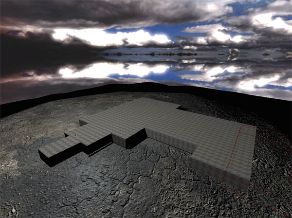
I started off by creating a couple of BSP cubes to walk on, just to get an idea of the size going. I only made one side of the house at this point as it was all going to be symmetrical anyway.
These BSP cubes were later exported to 3DSMax, using the OBJ export feature of the editor, where I used them as a size template for modeling the large rock spire.
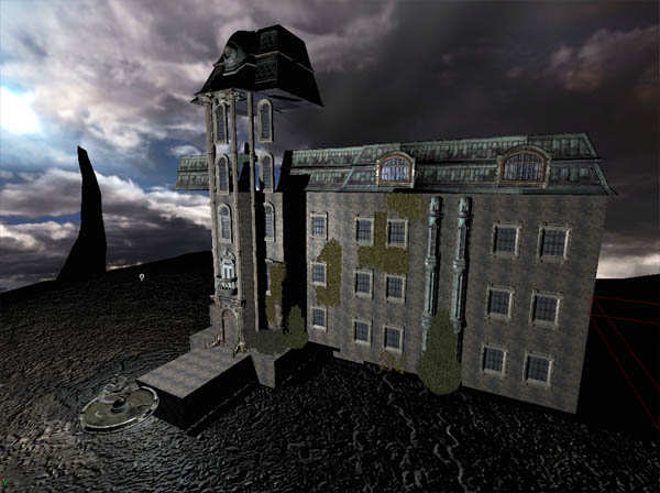
I browsed through the game’s mesh packages and found myself a whole lot of roof and window meshes, which I added on top of the BSP blocks.
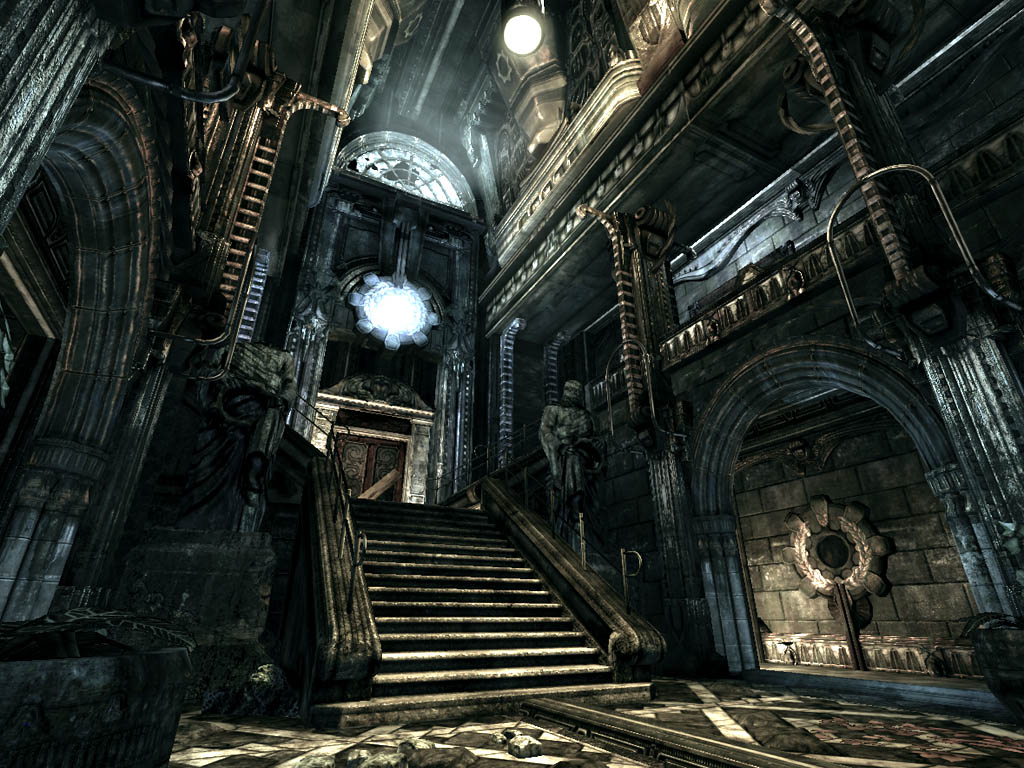
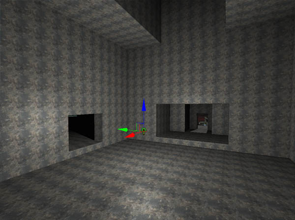
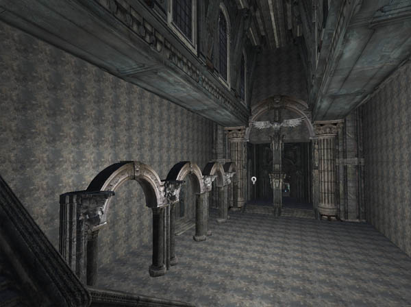
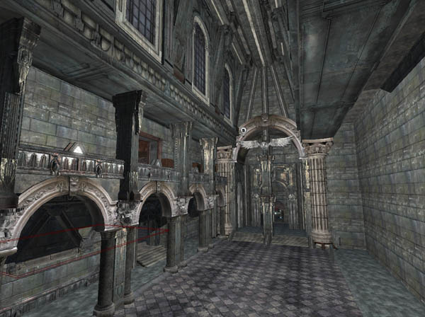
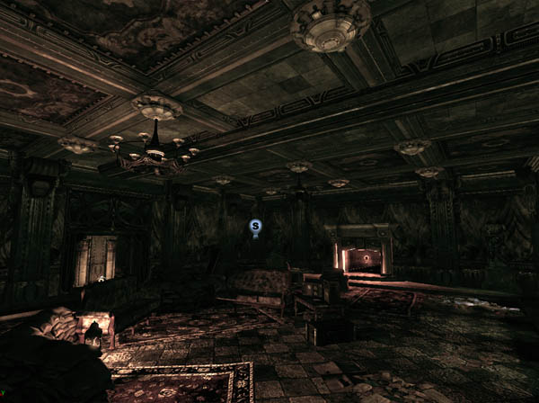
After most of the outside was more or less done for the time being, I moved on to the inside, where I shaped up the general look and size of the rooms with simple BSP cubes. This is the main entrance hall, looking in the direction of the front door.
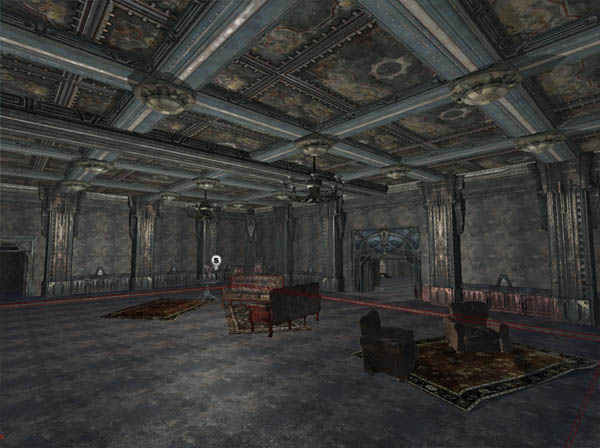
Once the basic size and shape was defined, I started throwing in lots of meshes. Usually, I always start off by throwing in some interesting meshes, to get an idea of what I have available mesh wise, and then fill up all the remaining holes with BSP brushes or custom modeling. I later redid everything you see in this picture as it was too much of a mess and too inconsistent. The dark metal pieces were too mixed up with the white stone elements such as the arches and the pillars, which harmed consistency. I eventually ended up doing everything with metal meshes.
I the mean time I also applied a first lighting test to the exterior. The sky was blue on one side, red on the other, so I ended up adding red lighting to one side of the estate, which didn’t really work out well, as it made it look like a cheap horror movie. I later replaced the red lighting with a more subtle yellowish orange color.
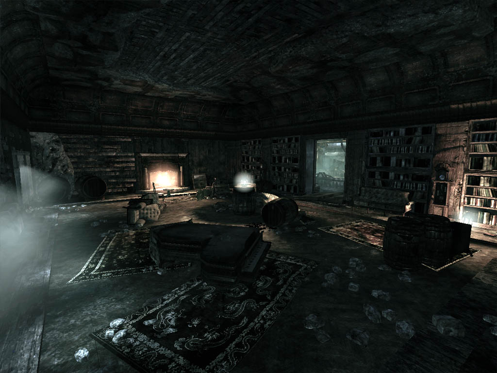
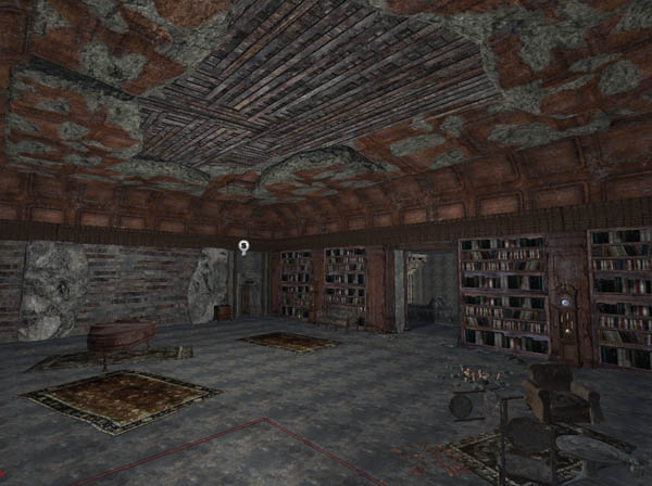
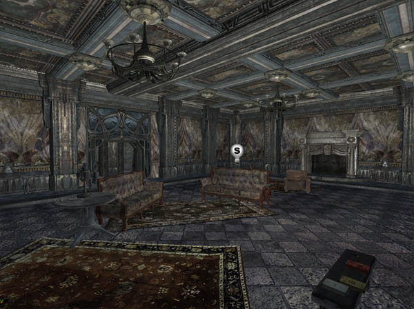
Back in the inside, I started working on a side room. The room is made up of just two brushes. One brush for the room itself, and a smaller brush to cut out a little indent in the floor.
The second side room was made in a similar way. It also exists of just two brushes, and everything else is made up of meshes, including the entire ceiling.
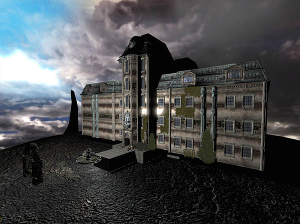
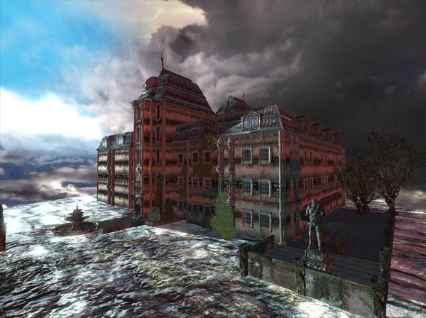
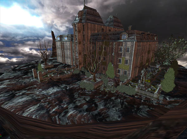
Once the inside was more or less satisfactory, I started working on the exterior again. I always try to make all areas progress roughly simultaniously to safeguard my own motivation and the style of building. The large spire the estate is build on was still too large in this screenshot.
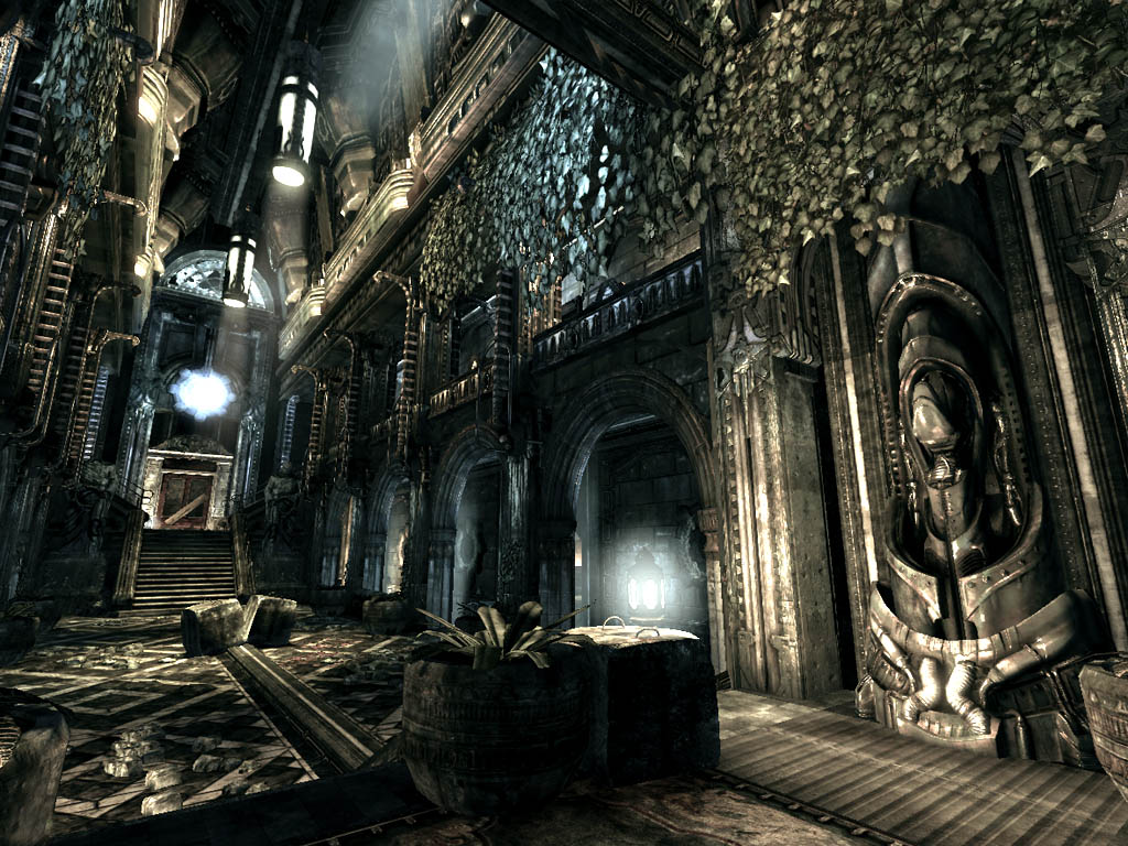
After the garden was also brought to a satisfactory quality, I had more or less applied detail to all areas, and it was time to move on to the next stage: lighting.
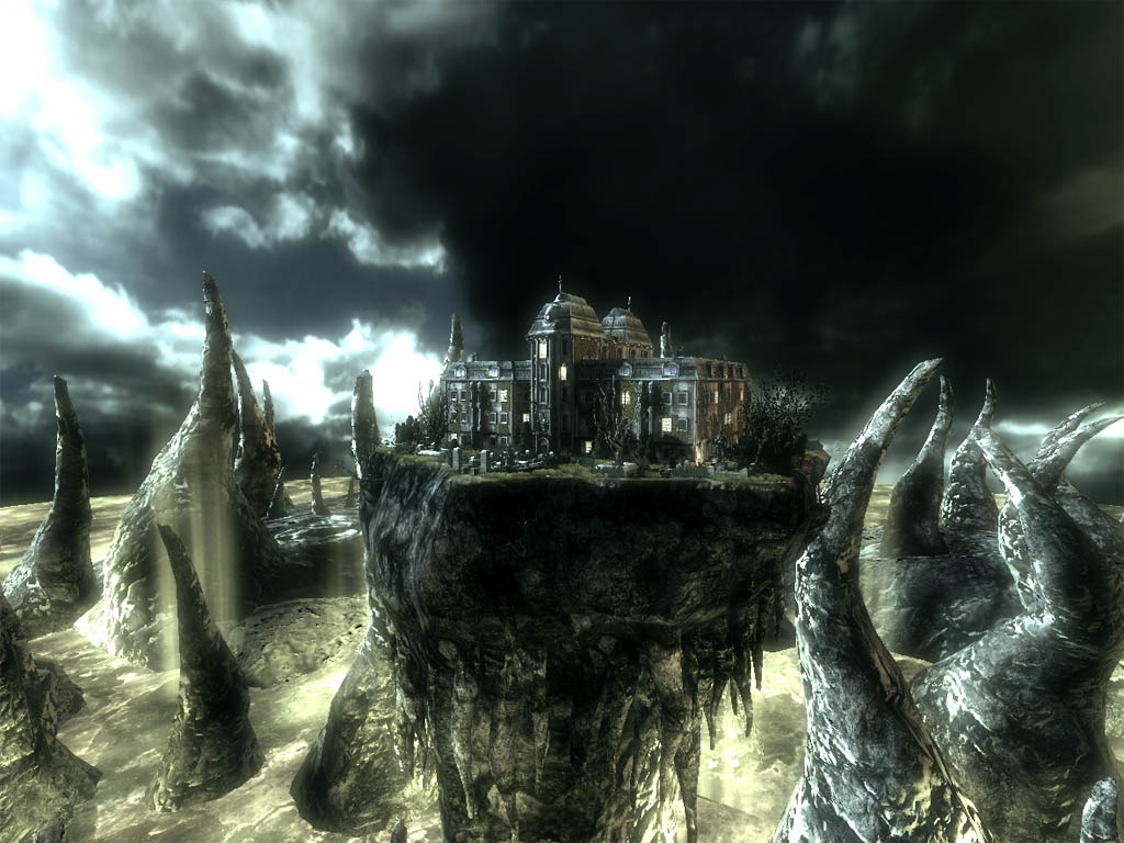
At this point outside lighting also started to shape up, the rock spire was resized, and post process settings were applied to alter the color and contrast. A higher contrast usually adds more drama and decay to an image. The sky still blooms too much though, which was fixed later on. A too intensive sky would have ruined the composition and would have taken away too much focus of the level itself.
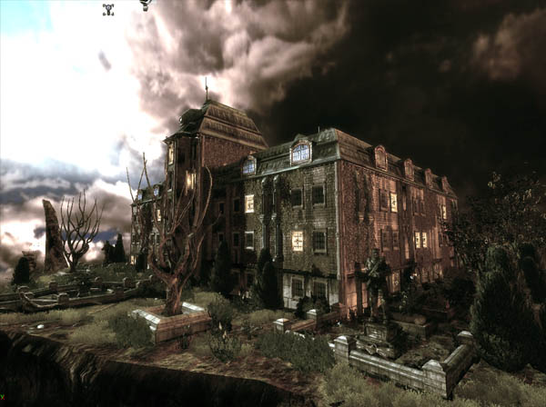
Eventually I also added a sea of immulsion to the level, as the surroundings were too dark and lifeless, and I needed something to live it all up and make it truly shine. I also added a chopper circling the estate, to add some dynamism to the whole.
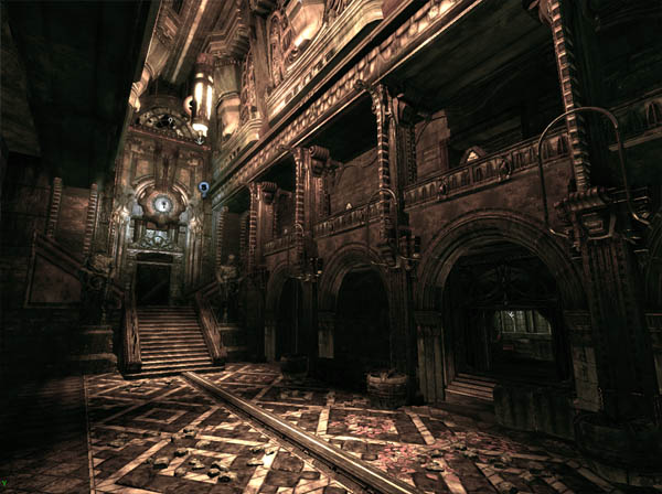
The Result